The psychology of colour in product labels
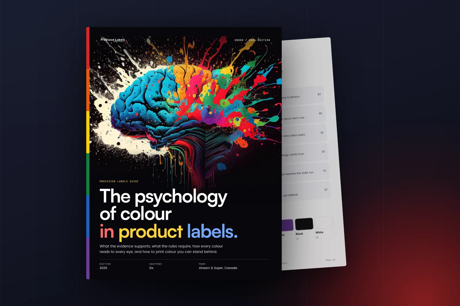
A 28 page guide to colour on product labels: what the evidence supports, how every colour reads to people with colour blindness, which text and colour pairs pass contrast, what the rules require and how to print colour you can stand behind.
Get the document
Tell us who you are and we will email you the download link straight away.
The link is on its way to your inbox
We have emailed the download link to the address you gave. It usually arrives within a minute. If you cannot see it, check your junk folder.
Inside this guide
- What colour can and cannot promise
- A working palette, hue by hue: what is on record for eight hues, with colour blindness simulations, text contrast and colour harmonies for each
- How every eye reads colour: the three cone types, colour vision deficiency and measured text contrast
- Where the rules set the colour: WHMIS in Canada and OSHA in the United States, plus health care and food labels
- Printing colour on demand, with a four point checklist
- Five steps from palette to print
A few pages from the guide
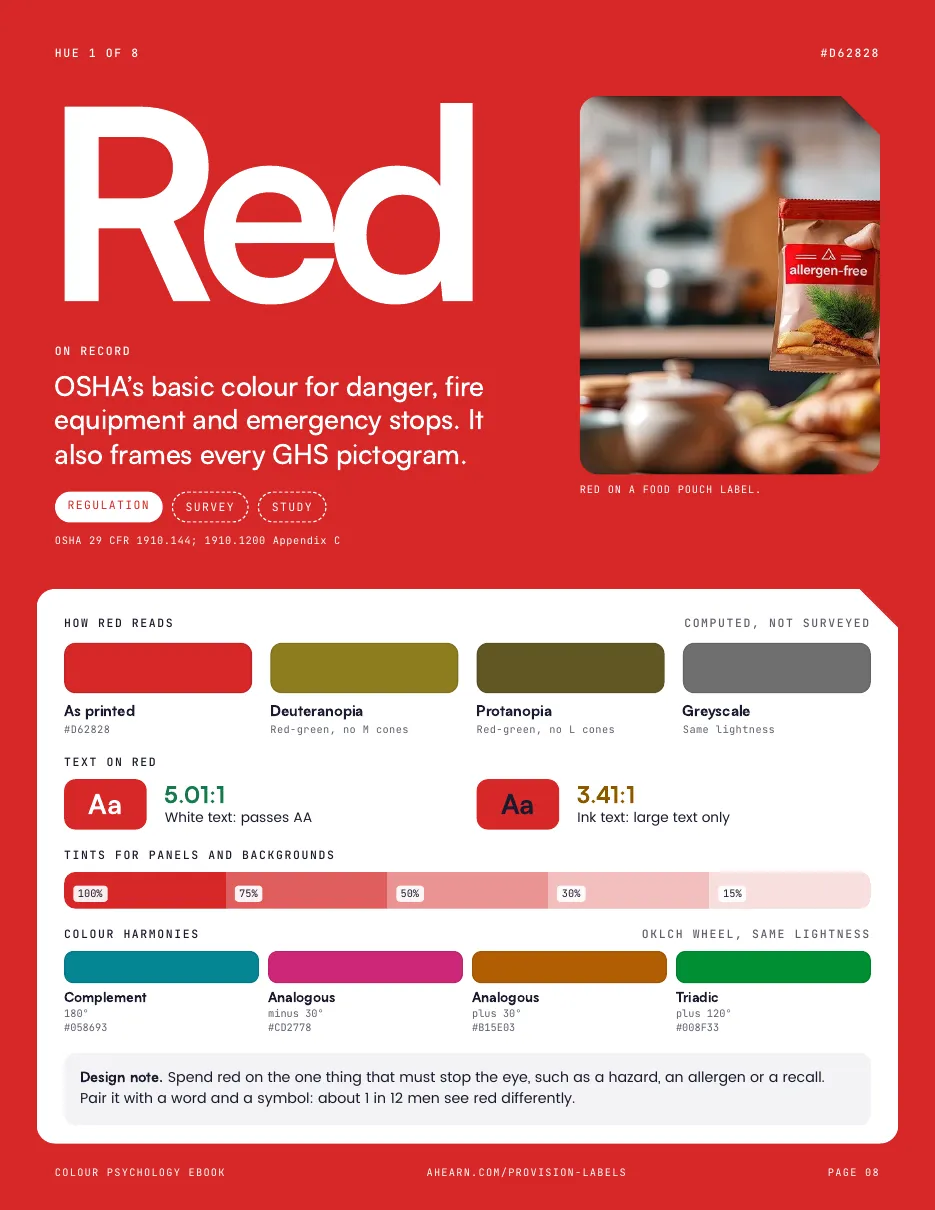
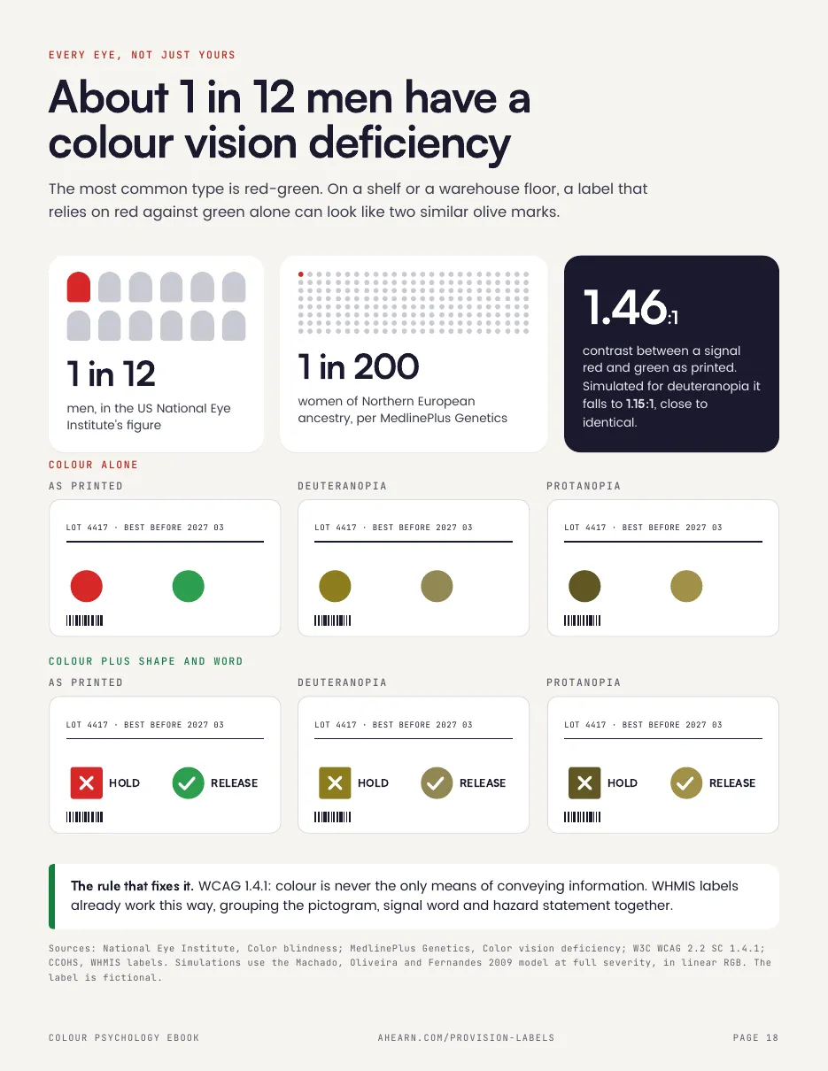
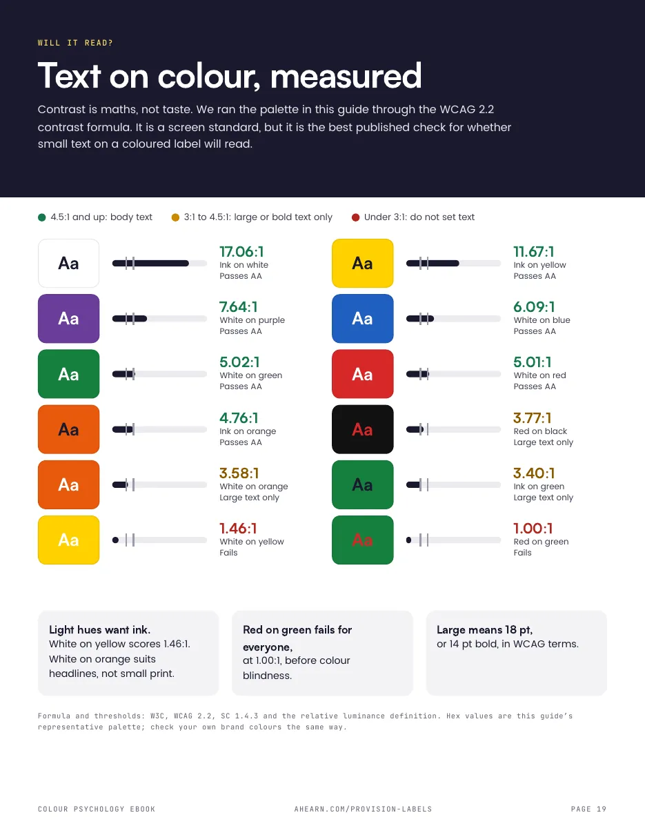
Who it is for
Anyone specifying, designing or printing product labels who wants colour decisions they can defend to a regulator, a buyer or a brand team.
Good to know
Regulatory summaries are general information, not legal advice. A French edition is also available.
Put this to work in your warehouse
Tell us what your operation has to do, and we will tell you plainly whether we can help.